CCHP

Overview
CCHP offers health plans balancing Western and Eastern remedies to individuals, families, and employers of all sizes. It participates in the Covered California marketplace and offers Medicare Advantage Prescription Drug plans in San Francisco and San Mateo counties.
Problem
After constant attempts of expanding its commercial membership in the last few years, the Medicare membership - which made up most of the total member population - was losing momentum and started to shrink.
Goal
Create a brand for Medicare line-of-business to Increase membership and build brand loyalty to stay ahead of the increasing competition in the Chinese market of Medicare.
Understanding the Audiences
Who are we serving?
Quantitative research on membership and user engagement was conducted to identify the primary audience. Additionally, qualitative research on the current marketing approach was conducted to find the existing issues.
Majority
The current Medicare membership is mostly made up of Chinese.
Interest
Chinese prospects are on average 20 times more likely to show interest.
Misalignment
Chinese participants interpreted the current marketing visual direction and messages as signs of the company moving away from their market.
Confusion
Most participants thought the current approach of removing the Chinese characters from the logo makes it look generic and confusing.

Revisiting the Goal
What are the suitable changes?
Other direct competitors mostly use green, blue, or purple for the brand color. Red is already a great choice to stand out in addition to the cultural meaning. Since the audience mostly consists of traditional Chinese seniors who aren't comfortable adapting, any drastic changes would be too risky. Thus, the new logo needs to not only be modern but also familiar.
New Brand
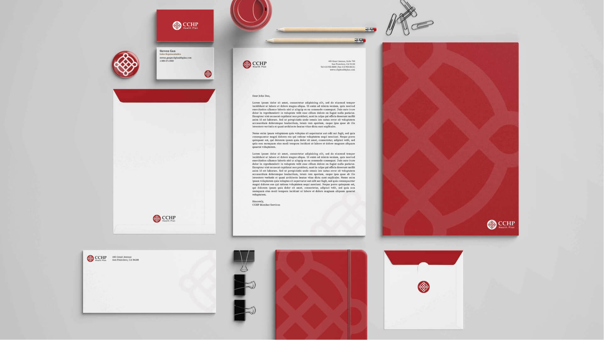
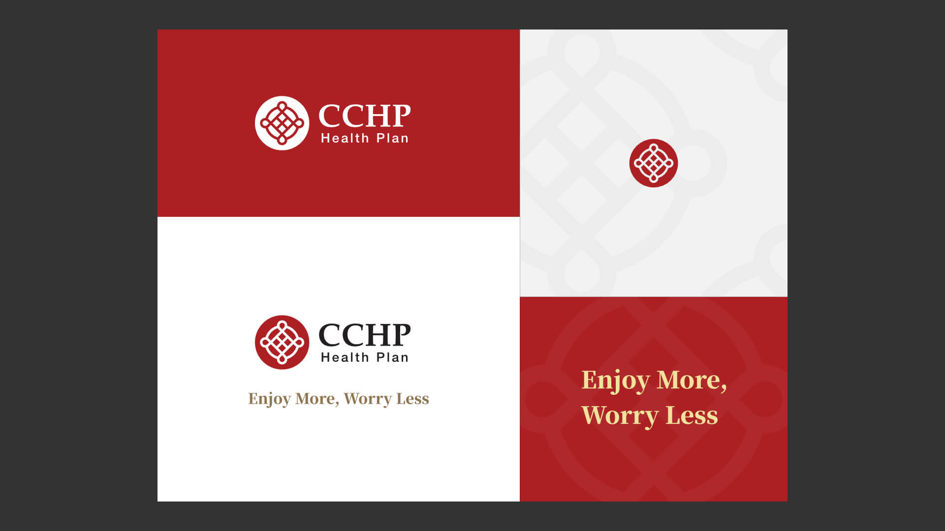
The new design replaces the language-specific stamp with a meaningful logo mark.
The text is kept in the same font to maintain familiarity, but the font weight is adjusted for better readability. Additionally, the brand color is changed to a more vibrant red to better stand out from the competition.
The Chinese logo shares the same composition as the primary logo, which will keep the consistency for recognizability.


The mark consists of two elements: the community and the provider network. It echoes the origin of the company: a group of community physicians helped establish CCHP. It also represents a Chinese knot, a symbol of longevity and eternality in Chinese culture.
This logo mark is also a versatile branding element that can be used in all kinds of formats.


Impact
With this new direction, there was about a 250% conversion increase overall during the following annual enrollment period for the plan year 2021. While the Chinese prospects remained 20 times more likely to show interest, in comparison with the previous year, there was a 256% increase in engagement on the Chinese landing page and a 254% increase in engagement on the English landing page.
According to Deft Research’s 2021 Medicare Shopping and Switching study, the Medicare Advantage beneficiaries switching to a new carrier was down 21% over last year. Thus, the increase in enrollment for the plan year 2021 is a major milestone.