Moovie

Overview
As part of Google’s immersive UX certificate program, my prompt for the project is to design a mobile ticketing app for a movie theater in Portland.
Process
Empathize
- Market Research
- Competitive Analysis
- User Interviews
- Empathy Maps
Define
- Personas
- User Journey Maps
Ideate
- Wireframes
- Low-Fidelity Prototype
- Usability Tests
Refine
- High-Fidelity Mockups
- High-Fidelity Prototype
Evaluate
- Usability Studies
Business Problem
Since the pandemic, people’s preference for movie consumption has changed.
According to a recent survey published by Variety, 70% prefer stream over theaters. Only 13% prefer theaters over stream, and the remaining 17% are unsure. Moreover, this trend is also reflected in the revenue of each industry - streaming services thrived while the traditional theaters suffered.
As the pandemic got worse, Indirect competitors turned direct.
My competitive analysis revealed that more and more movies became available on streaming platforms and digital media stores on premiere days. On the other hand, theaters were slowly reopening, but they had to follow safety guidelines and regain consumer trust.
Challenge
How might I compete in the market, and differentiate the experience?
Understanding the Users
Who are we serving?
To learn about consumer opinions, I need to identify the primary users to conduct user interviews. According to my research, Caucasians, Asians, and African Americans at age 25 – 39 are likely the primary user group.
Digital premieres might not be as convenient as I thought.
Through interviewing 5 matching people, I discovered that they weren't all happy about the digital premieres due to the added complexities and limitations.
Time
People are too busy to keep track of new movies’ platform exclusivities.
Options
4 people wish that there is a streaming option for new movies.
Decision
People need to do additional research due to insufficient info on many platforms.
Discovery
2 people expressed that they aren’t aware of new releases due to the shift to working from home.
Based on the learnings from the interviews, I identified the two main types of customers in the market.
While some Interviewees enjoyed the convenience of digital premieres, others missed the immersive theater experience.

Kevin is a Project Manager and a father of two who needs a pay-as-you-watch option for streaming new movies because he is tired of subscribing to a new platform for one movie.
While I miss going out to watch movies with friends and family, I am happy with the convenience of streaming.


Mia is a busy Barista who needs straightforward access to new movies because it is a hassle to keep changing subscriptions for exclusivities.
It is quite overwhelming to start because there are so many streaming platforms, and I miss watching movies in theaters.

Revisiting the Prompt
Will a movie ticketing app help?
The research and interview insights revealed that a simple ticketing app might not fill the gap. The business could expand its potential by selling movie tickets for other theaters. However, adding a streaming option for movies would be necessary to differentiate itself from the competition.
Iterating the Solution
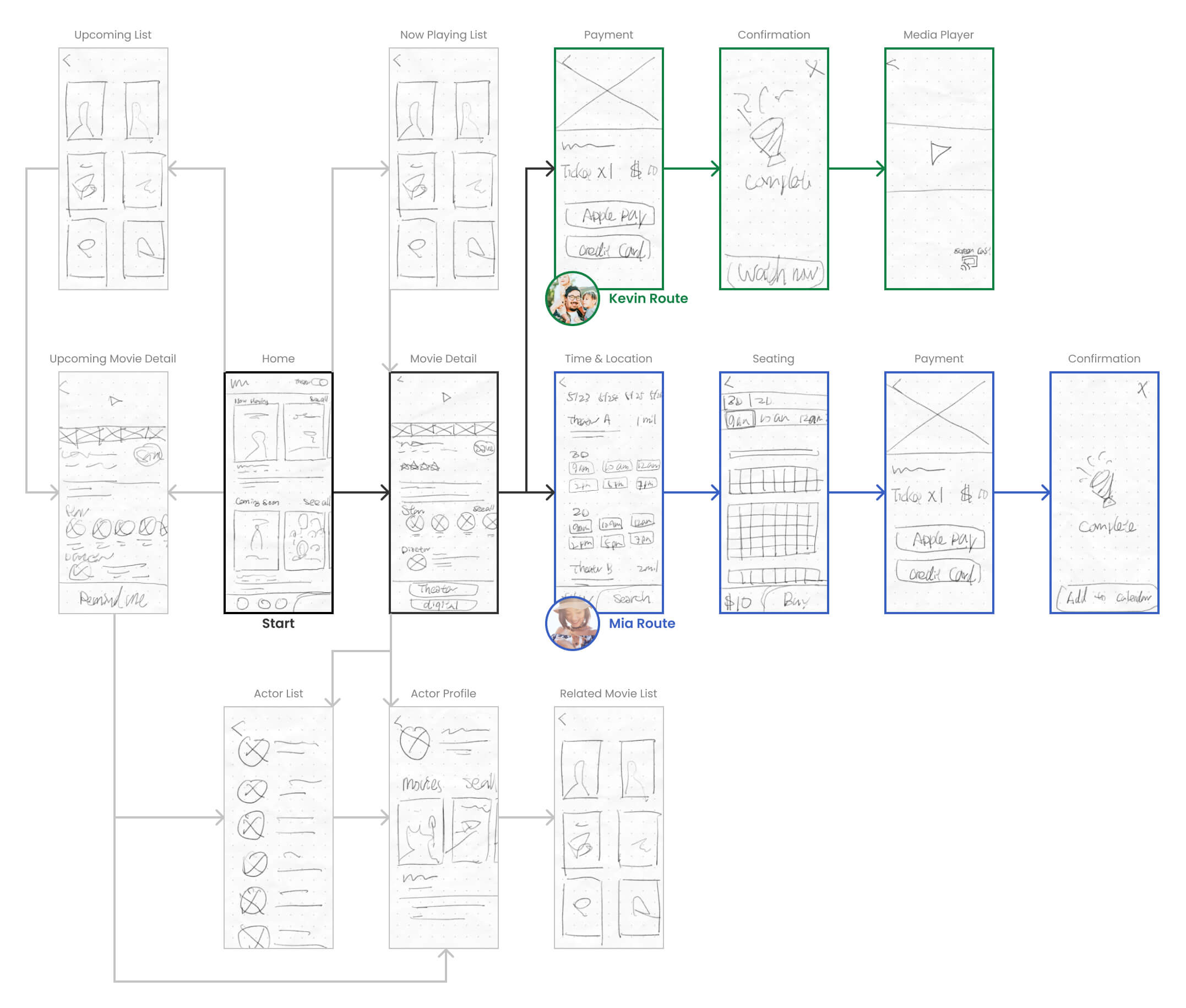
The personas helped me determine the key screens in the experience.
Keeping the persona needs in mind, I sketched out wireframes on paper to explore different possibilities. Moreover, these sketches allowed me to map out the user flows.
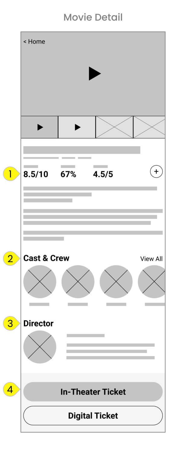
The movie detail screen had to present the right information to address the pain points.
All pain points are rooted in unwanted additional works. Rather than actively encourage users to spend time outside of the app, I aimed to include all the needed information for decision-making in every step.
Critic Scores: Users could quickly decide to proceed or not with movies.
Cast & Crew: Profile pictures and names allowed users to identify actors they liked.
Director: The brief description enabled users to set expectations on the storytelling style.
Universal Ticket System: Users could choose their preferred way to watch a movie with a simple direct purchase.
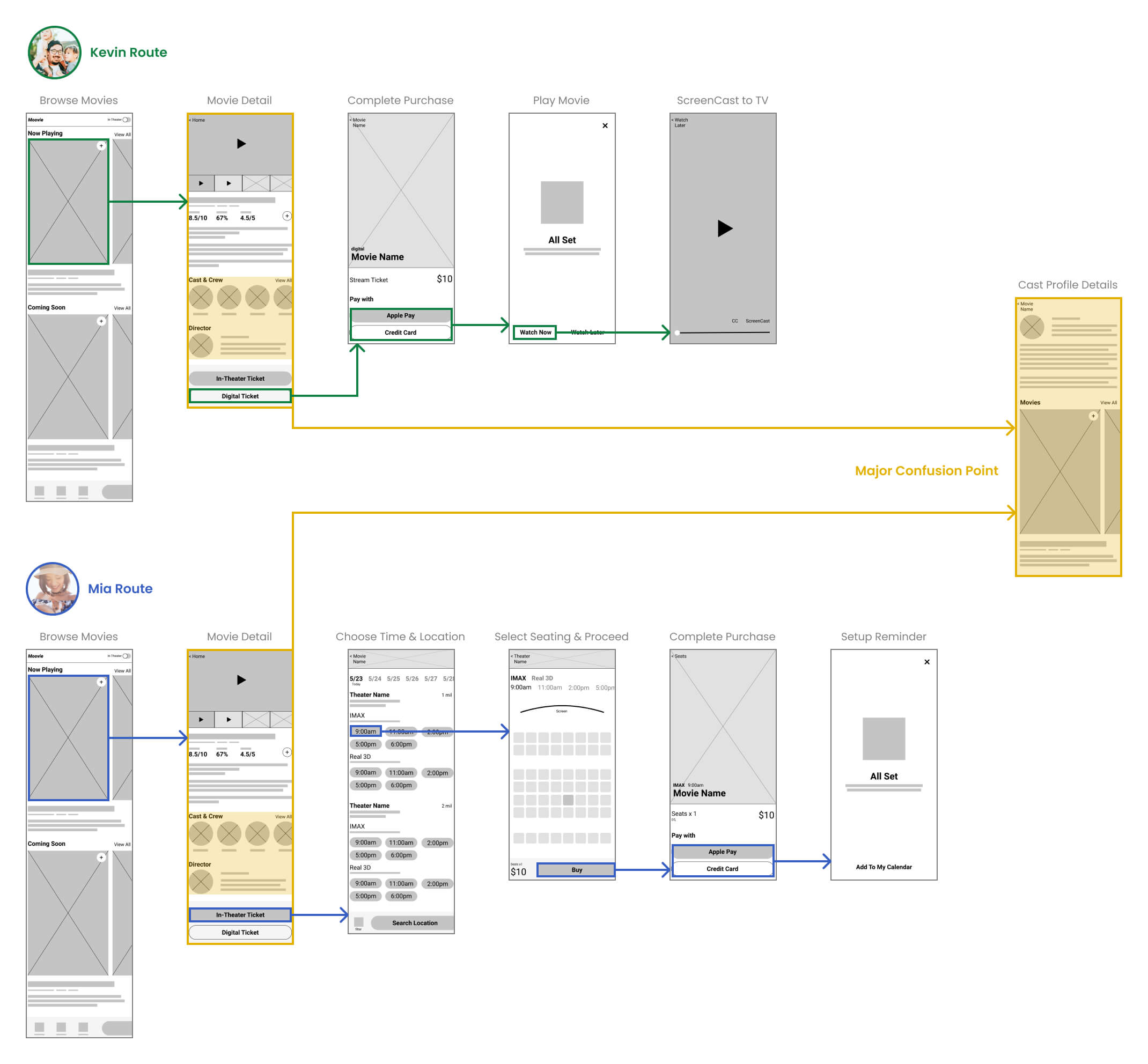
Low fidelity prototype revealed oversights and opportunities early.
I conducted remote unmoderated usability tests with 5 people to verify my approach. While participants confirmed that many designs are pleasant additions, they also revealed a major oversight from the cast profile screen.
Many participants expressed that they got lost after exploring the movies on the cast profile screen.
Additionally, few participants highlighted that the flow felt unfinished because they couldn't see the ticket in their library.
Movie discovery shouldn't have been in the secondary flow in the cast profile.
Redesigning the home screen allowed users to discover movies easier at a glance, and removed the confusion point that took users out of the main flows.
Movie List: Instead of seeing one movie at a time in two different sections, users could see 3 at a time and toggle between sections in the new design.
Trailers: Users could discover movies the theater way with a dedicated trailer section for current and upcoming movies.
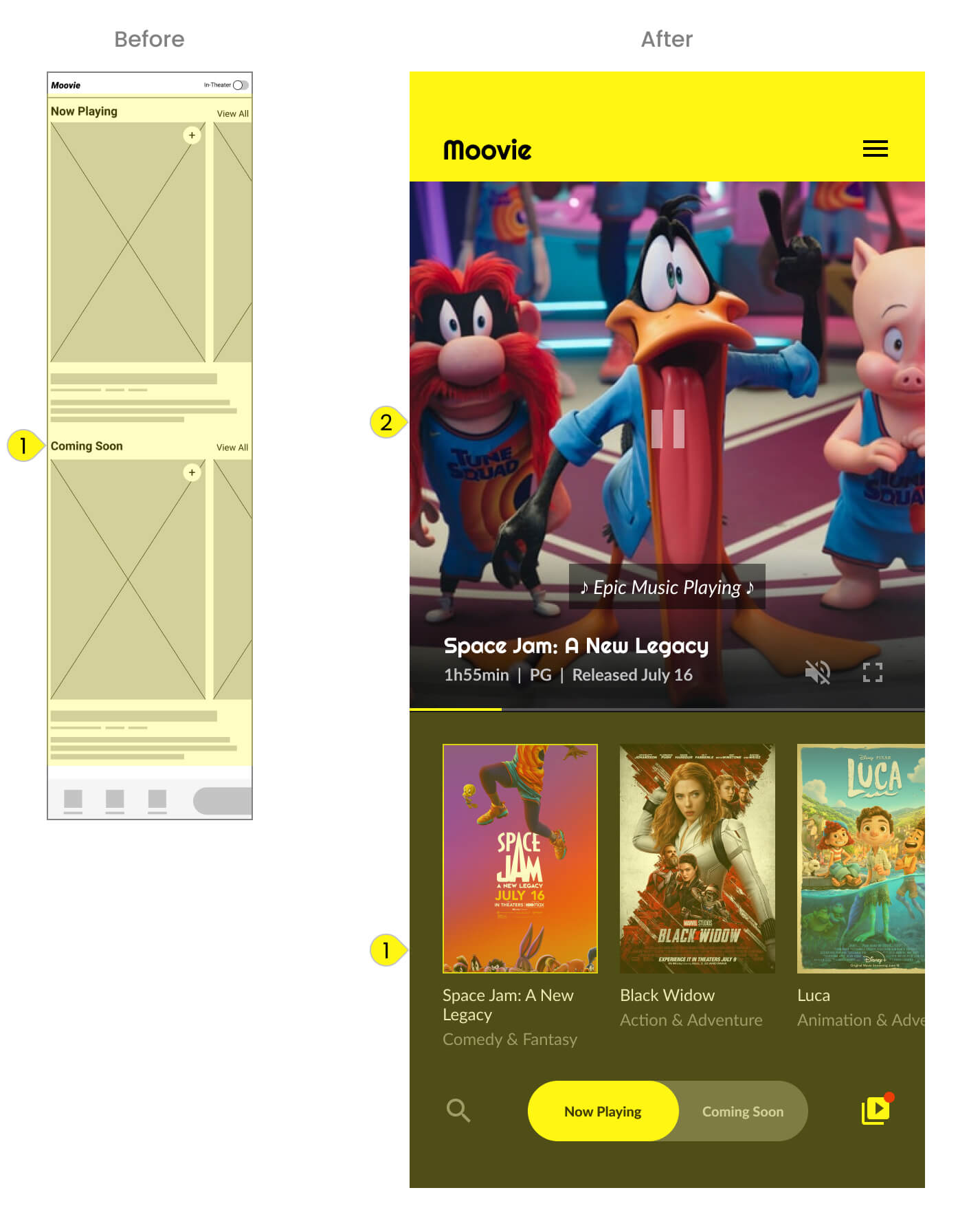
Touch target size could make or break the experience.
Keeping the touch target's width and height of every interactive element at least 44px provided better accessibility. It also ensured users tap on elements with accuracy.

High fidelity prototype established a realistic experience to receive a more accurate evaluation.
In the second round of remote unmoderated usability studies, participants responded positively to the whole experience with only a few minor feedbacks. For example, participants wanted to see the expiration date of streaming tickets on the checkout screen.
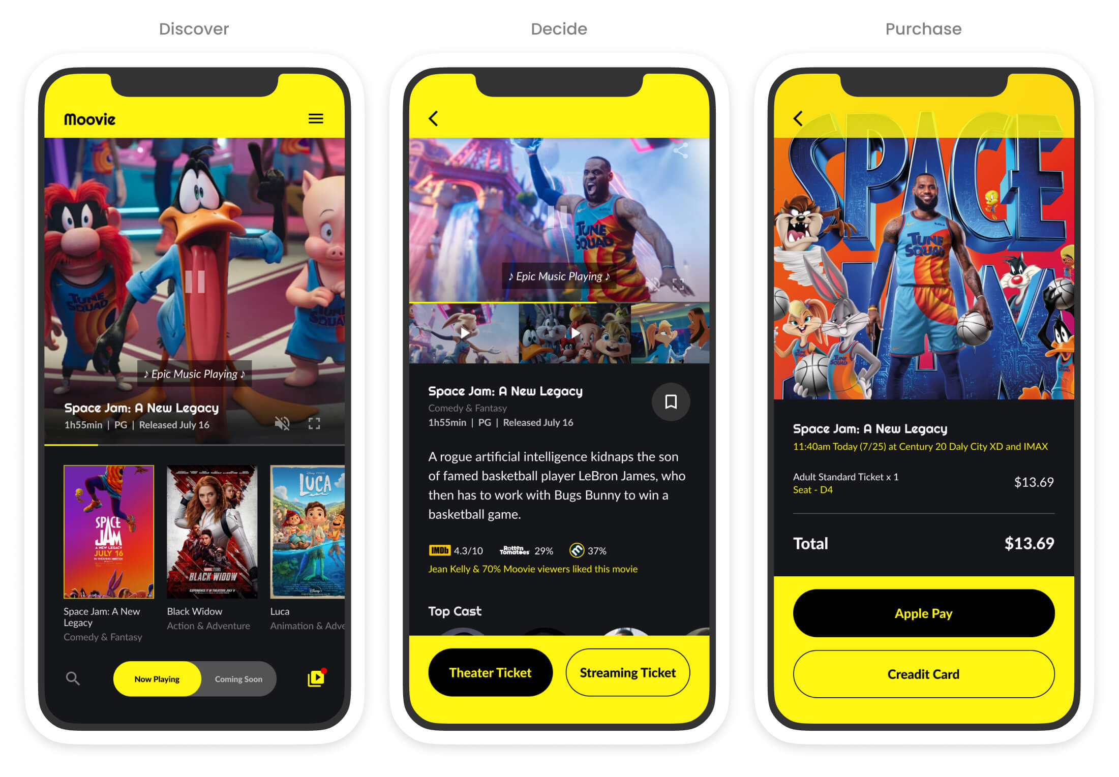
Final Result
A movie ticketing app has a streamlined transaction process and a delightful movie discovery experience that
doubled the completion rate from the initial low-fidelity concept and
received high satisfaction ratings from participants in the final usability study.
A quote from user feedback
The app is very clean and straightforward, even little kids know how to use it.

Learnings
I was surprised by the number of oversights discovered through the usability studies. Thanks to the user feedback, I improved the design tremendously from my initial concept. I also learned that using shapes as placeholders is very confusing to users.
With hindsight, I do wish that I would've considered the risk tolerance and scope more because it is likely not a fitting solution for a small company due to the risk and implementation cost.


