Pentatonix
Overview
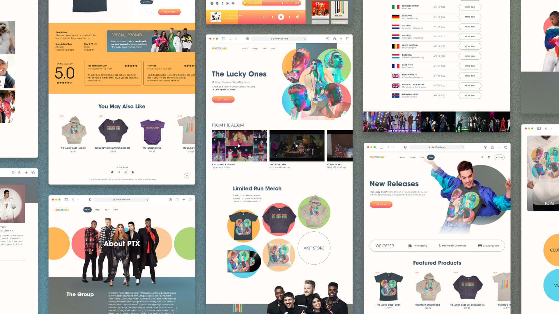
As part of Google’s immersive UX certificate program, my prompt for the project is to design a merchandise customization flow for a trendy musician. Since I am a fan of a carpella, I chose Pentatonix, a cappella group of 5 vocalists, for the project.
Process
Empathize
- Website Inspection
- Competitive Analysis
- User Interviews
- Empathy Maps
Define
- Personas
- User Journey Maps
Ideate
- SitemapWireframes
- Low-Fidelity Prototype
- Usability Tests
Refine
- High-Fidelity Mockups
- High-Fidelity Prototype
Evaluate
- Usability Studies
Business Problem
The fragmented website experience is likely hindering the sales potential.
In a pandemic with many restrictions to events and public gatherings, a solid online business seemed like a must-have for any musician, including Pentatonix.
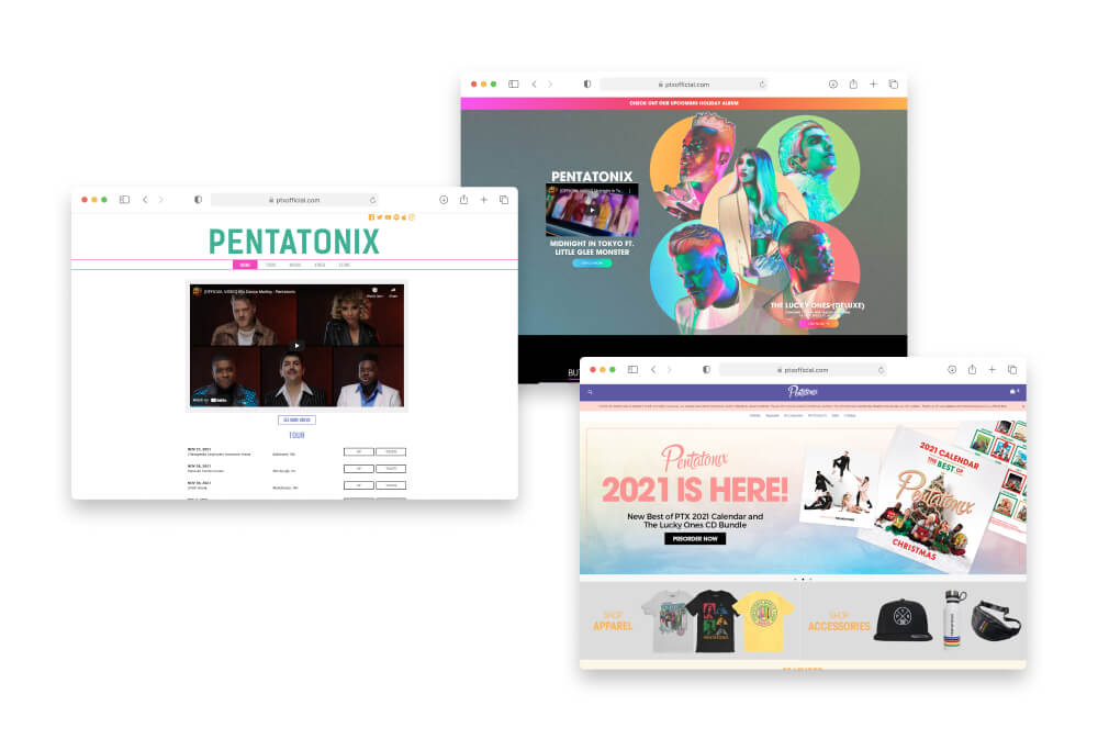
The group's current website consists of 3 visually distinctive parts — the landing page, the info pages, and the store page. Due to this visual inconsistency, their online merch sales are likely underperforming because visitors might perceive their brand as less valuable.
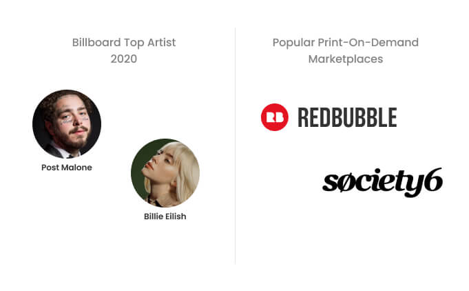
Scarcity and variety are the two common approaches to selling merchandise.
Trendy musicians mainly sell merchandise themed after their most recent releases. Such an approach creates artificial scarcity that motivates purchases.
On the other hand, Print-on-demand marketplaces provide great merchandise varieties for each design. A customer would likely find something they like and complete a transaction.
Challenge
How might I unify these distinctive elements with the customization into a cohesive experience?
Understanding the Users
An online store would satisfy the majority of the fanbase.
An industry insider with 3+ years of experience working with Artists, Labels, and Managers shared the four types of fans and his approach to meet their demands.
True Fans
Collect exclusive stuff
Sell limited, exclusive, and time-sensitive items online
General Public
Own the music
Sell nice packaged CDs and a variety of merch on a well optimized online store
Concert Goer
Remember the experience
Sell event-specific merch if possible. Likely won't buy online.
Friends & Families
Support the artist
Don't put prices on merch. Provide simple merch with big image and artist name
A user could give up a transaction due to 3 reasons.
To get some insight on the reasons for not buying, I conducted user interviews with 5 people who had been to a concert or bought merch in the past two years.
Use Case
Many interviewees prefer to buy something they would use in their daily lives.
Event-Specific
Some interviewees want event-specific designs to remember the experience.
Visual Preference
Interviewees hesitate when the merch design doesn’t match their preferences.
The learnings from the interviews revealed that merch design could make or stop a transaction for our users.
Interviewees confirmed that they are more likely to buy decorative merch with preferred design than useful ones with undesirable design. Based on the insights, I created two personas.

Shawn is a busy Sales Rep and a music fan who needs intuitive merch shopping and customization experience because he wants to support musicians through merch with preferred designs.
I would love to support the artists, but it is hard to do so when the merch design has gone a bit too far for my taste.


Amy is an office worker and a music enthusiast who needs an alternate design for merch because she wants to use the merch in her daily life.
Sometimes I wish there were alternate designs in my preferred styles for the same merch.

Revisiting the Prompt
Design customization seemed like the best fit to address the pain points.
Iterating the Solution
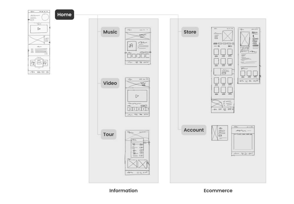
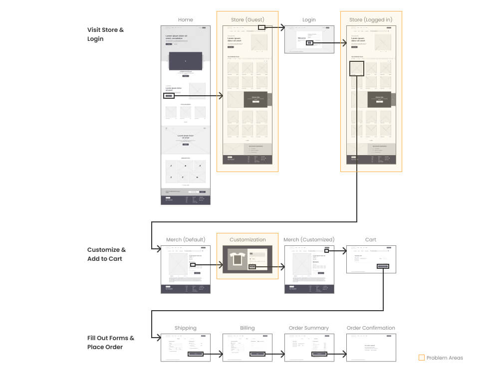
Sitemap helped me plan out the site structure and identify the necessary pages for a solid solution.
To provide a smooth transition to the existing audiences, I used the current site structure as a base to tie all the loose elements into a cohesive experience, including the new feature.
Getting the customization options right was crucial to meet the user needs.
According to this article, t-shirts are the most popular merch among any influencers. Finding the right balance of t-shirt customization would set the template for other merch.
Design & Design Color: Users could choose their preferred design, and set the design color for the t-shirt.
Placement & Size: Users could further customize the t-shirt on the design placement and size.
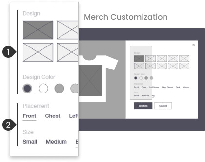
Low fidelity prototype helped highlight the design flaws early in the process.
For a more focused evaluation of the shopping experience, I limited the low fidelity prototype to only store-related pages and the home page in the remote unmoderated usability tests with 5 people.
Many participants expressed that the design felt more like an eCommerce store than a music group's website due to the inability to learn more about the group. Additionally, some also felt the customization was a bit overwhelming.
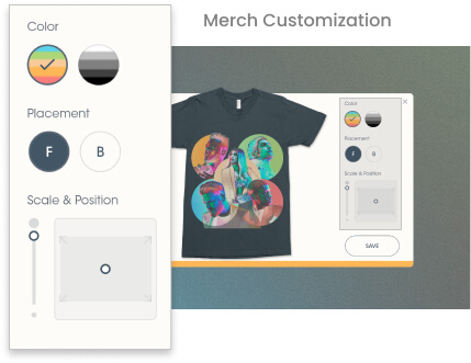
Too many options would discourage users from proceeding.
The feedback made me realize that I went too far with the customization.
Additionally, limiting the design options to the customization screen hid these options away from the users. There was a high chance that users wouldn't know the design options if they didn't choose to customize. Thus, I removed the design options and simplified the customization screen to be more user-friendly.
Better form accessibility provided a smoother experience.
To enhance the shopping experience, I added address suggestions to streamline the form-filling process.

Adding the informational pages to the high fidelity prototype allowed the concept to receive a more accurate evaluation.
In my second round of remote unmoderated usability tests, participants were very satisfied. They expressed that the design was easy to use and very engaging to navigate through.

Final Result
A cohesive web experience with merch customization that
had full completion rate, and
received high satisfaction ratings from all the participants in the final usability study.
A quote from user feedback
This customization is unique and intuitive.

Learnings
I am amazed by the effectiveness of usability tests in early iterations. It helped me realize that more doesn't always mean good. A balance between curation and option is necessary to ensure a smooth experience. User feedback played a big role in making this concept come to life.
The next steps for this project would be designing the supporting pages and finishing the mobile layouts.